Welcome to Week 79 of CASology! Take a look at this week's cue word:

I am really interested to see what everyone does with the cue word this week. There are lots of ways to interpret it: contrasting colours, the contrast of light and dark, etc. The CASology team have created two cards for this week - a CAS card and a not CAS card - a CASology contrast! Here's my not CAS card:


And this week's guest designer:
Link your creations to the CASology blog and remember that submissions are due by 4pm CST on Sunday, 26 January.
Supplies Used:
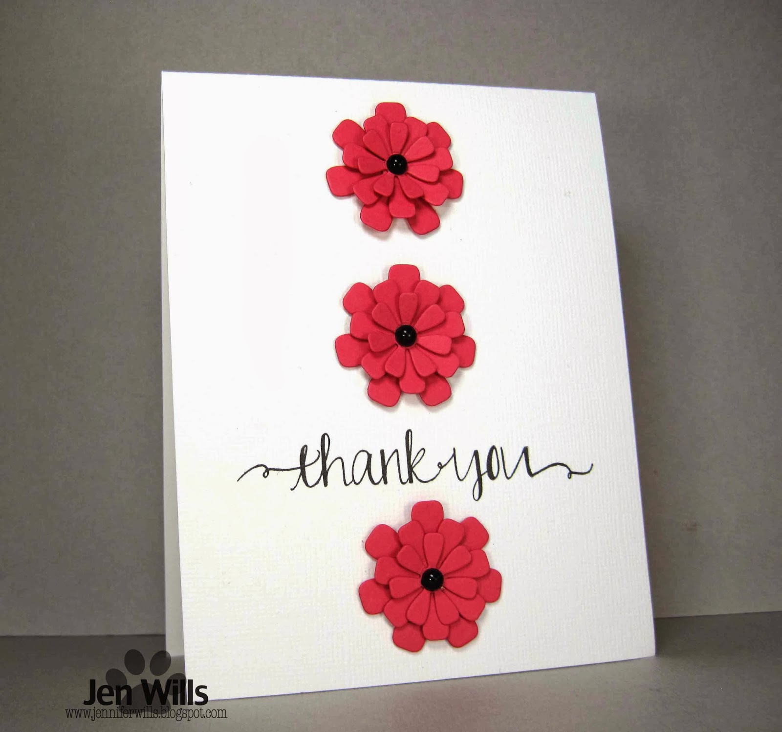
CAS Card
Cardstock: (White) Bazzill, (Strawberry Slush) Stampin' Up
Stamp: (Sentiment from Oh Happy Day) Avery Elle
Ink: (VersaFine Onyx Black) Tsukineko
Dies: (Flower Trio) My Favourite Things
Gems: Recollections
Non-CAS Card
Cardstock: (White) Bazzill
Patterned Paper: (My Girl 6x6) American Crafts
Stamp: (Sentiment from Oh Happy Day) Avery Elle
Ink: (VersaFine Onyx Black) Tsukineko
Dies: (Flower Trio) My Favourite Things
Punches: (1/8" & 1/4" hole punches) McGill
Other: (Glossy Accents) Ranger
19 comments:
These are both gorgeous, but there is definitely a difference! Great demonstration of CAS!
Love the cards ..a real contrast ..love the blooms :)
These are both just beautiful, and such a treat to see the two versions together. Must admit to a preference for the first.
Perfect take on this week's cue card! Your explanation and your non-CAS card are perfect!
Love your cards and well done on using the same card design!!!!
I love both!!
Jen, these two cards make it very easy to see the difference bwteen CAS and not-so-CAS. Both are beautiful, but I adore the CAS version!!!
Both cards are wonderful! :) Love all the white space and red flowers on your CAS card!
Both fab cards Jen, I was dying to see your non contrast card as soon as it appeared on the blog and I love what you have done
Jen these are fab :) so similar yet to different !!
Oh how cool...love how you interpreted the contrast. Fabulous! And those Avery Elle fonts...thinking I "need" some of their stamps!
I think contrast is turning out to be my most favorite cue card yet. What a great sample of CAS VS not CAS. Love both.
It's been really fun seeing 2 cards from the DT! What a difference white space makes...even though the card is almost the same...so much fun! I love those blooms and that fabulous thank you font.
Both lovely Jen, but your first card is definitely more CAS. Great lesson on design.
What a fun challenges. Your cards are both amazing, and I appreciated all the tips as I love the CAS style but am not always able to achieve it.
I was really having some difficulty wrapping my mind around this cue word, and now I GET IT! I love both these cards, and it definitely underlines the CAS style! Love that font - gorgeous!
Being a CAS girl at heart - I love your red blooms against the white card best!
Love them both, Jen! The red against the white really does pop!
Such a brilliant way to demonstrate the cue word! Of course, you know me and CAS... I do like the first one just a bit more, but both are terrific.
Love both of these, Jen!
Post a Comment