Welcome to Week 79 of CASology! Take a look at this week's cue word:

I am really interested to see what everyone does with the cue word this week. There are lots of ways to interpret it: contrasting colours, the contrast of light and dark, etc. The CASology team have created two cards for this week - a CAS card and a not CAS card - a CASology contrast! Here's my not CAS card:


And this week's guest designer:
Link your creations to the CASology blog and remember that submissions are due by 4pm CST on Sunday, 26 January.
Supplies Used:
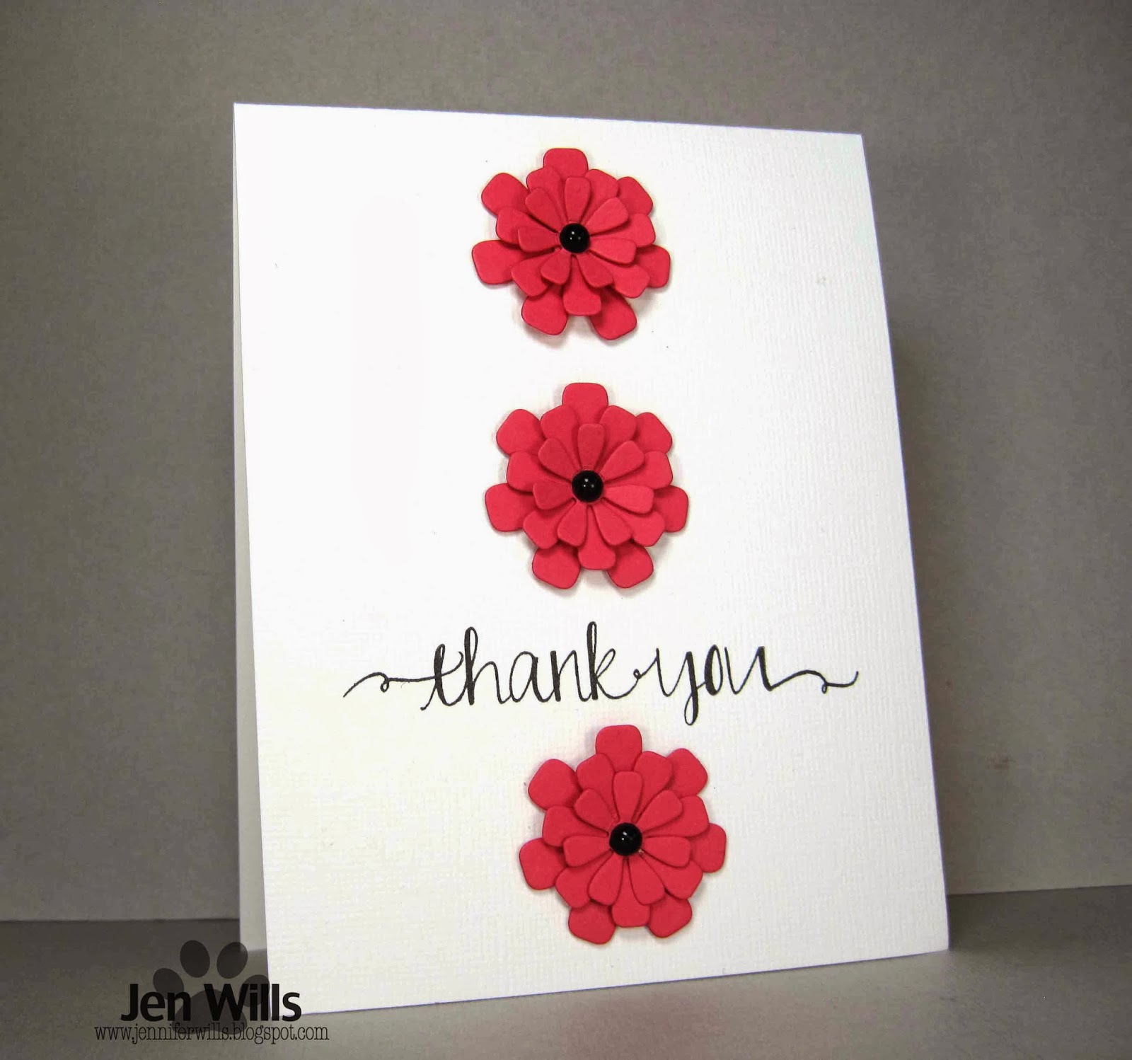
CAS Card
Cardstock: (White) Bazzill, (Strawberry Slush) Stampin' Up
Stamp: (Sentiment from Oh Happy Day) Avery Elle
Ink: (VersaFine Onyx Black) Tsukineko
Dies: (Flower Trio) My Favourite Things
Gems: Recollections
Non-CAS Card
Cardstock: (White) Bazzill
Patterned Paper: (My Girl 6x6) American Crafts
Stamp: (Sentiment from Oh Happy Day) Avery Elle
Ink: (VersaFine Onyx Black) Tsukineko
Dies: (Flower Trio) My Favourite Things
Punches: (1/8" & 1/4" hole punches) McGill
Other: (Glossy Accents) Ranger
These are both gorgeous, but there is definitely a difference! Great demonstration of CAS!
ReplyDeleteLove the cards ..a real contrast ..love the blooms :)
ReplyDeleteThese are both just beautiful, and such a treat to see the two versions together. Must admit to a preference for the first.
ReplyDeletePerfect take on this week's cue card! Your explanation and your non-CAS card are perfect!
ReplyDeleteLove your cards and well done on using the same card design!!!!
ReplyDeleteI love both!!
Jen, these two cards make it very easy to see the difference bwteen CAS and not-so-CAS. Both are beautiful, but I adore the CAS version!!!
ReplyDeleteBoth cards are wonderful! :) Love all the white space and red flowers on your CAS card!
ReplyDeleteBoth fab cards Jen, I was dying to see your non contrast card as soon as it appeared on the blog and I love what you have done
ReplyDeleteJen these are fab :) so similar yet to different !!
ReplyDeleteOh how cool...love how you interpreted the contrast. Fabulous! And those Avery Elle fonts...thinking I "need" some of their stamps!
ReplyDeleteI think contrast is turning out to be my most favorite cue card yet. What a great sample of CAS VS not CAS. Love both.
ReplyDeleteIt's been really fun seeing 2 cards from the DT! What a difference white space makes...even though the card is almost the same...so much fun! I love those blooms and that fabulous thank you font.
ReplyDeleteBoth lovely Jen, but your first card is definitely more CAS. Great lesson on design.
ReplyDeleteWhat a fun challenges. Your cards are both amazing, and I appreciated all the tips as I love the CAS style but am not always able to achieve it.
ReplyDeleteI was really having some difficulty wrapping my mind around this cue word, and now I GET IT! I love both these cards, and it definitely underlines the CAS style! Love that font - gorgeous!
ReplyDeleteBeing a CAS girl at heart - I love your red blooms against the white card best!
ReplyDeleteLove them both, Jen! The red against the white really does pop!
ReplyDeleteSuch a brilliant way to demonstrate the cue word! Of course, you know me and CAS... I do like the first one just a bit more, but both are terrific.
ReplyDeleteLove both of these, Jen!
ReplyDelete